-
Interior Designers: TanzoSpace Design Office
- Area: 2000 m²
- Year: 2018
-
Photographs:Yunfeng Shi, Zhi Xia
-
Lead Architects: Dachaung Wang

Text description provided by the architects. The surface of the architecture utilized high-fiber concrete from France, in addition, to wind tunnel type of parametric design. This is the first domestic architecture which uses such technology and has been known as the top ten transparent architectural exteriors in the world.
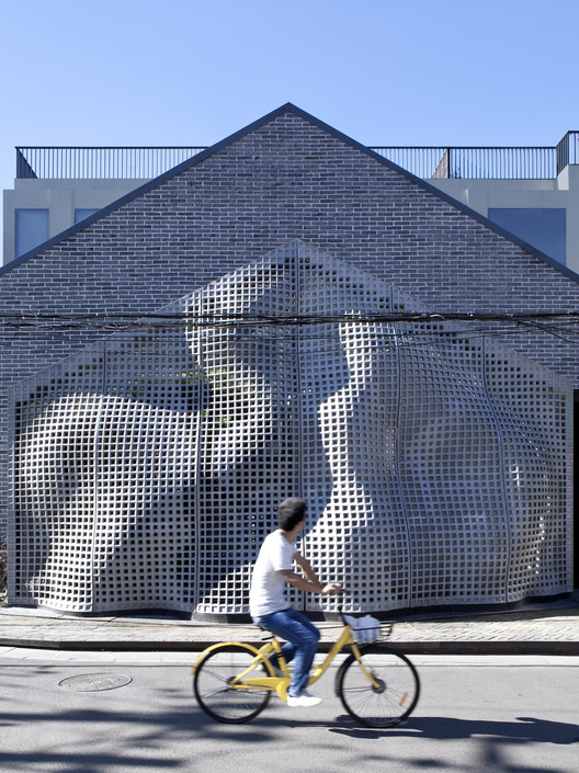
The lighting and shadow effects are presented in the morning in the interior, while the exterior utilizes hollow design. The effect is opposite at night, as the designer hopes to shape it into a unique space in the alley.

In the evening, People’s Art Printing Press serves as the center for projected mirror image, creating a new architectural space. Wang intends to add new dimensions to the existing structure, enabling an old building to integrate with the design organically.

No. 16 Bangchiao is sculpted on metal panel.

The image of MaoHaus is reflected in front of the building, which symbolizes the continuation of history.

Light of the Alley
Due to the building’s northern direction, it is difficult to introduce sunlight into the premise. In order to solve the issue, filters have been installed on the façade facing east and west, enabling the sunlight to remain on a white wall.

The designer places the view design on the wall in order to complement the lack of plantation in the alley. The design enables the garden to be installed in the space, creating a new micro alcove.

The art museum locates on the first floor, including lounge, bar, and office.

The house is built along a tree in the alley.

The tree outside the glass screen serves as transition space between exterior and interior.
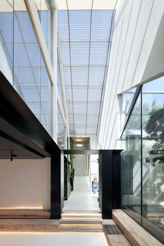
The lounge presents a strong contrast between black and white while retaining the elegance of wood.

Art museum exhibits numerous art pieces.
The sound of the Alley
The design of art is based on sensation, observation, and contemplation for life. So is space design.

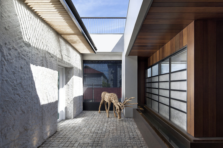
The first thing visitors would see upon reaching the second floor is the branch sculpture. The red branch creates a contrast in color with the background.

The exquisitely designed table serves as a unique scenery.
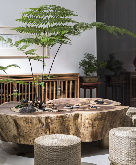
The designer said, “we preserve the original structure without excessive deco, and create a low-key light space.”

The white screen separates the main lobby. The designer utilizes simplistic materials throughout the space: gray sofa and stone-based grey wall, creating a cool atmosphere unlike outside.

The tea bar is installed along the window.
All forms of art come from life itself. As the designer implied, changes in alleys reflect the change of time.
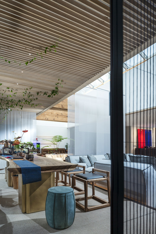
The designer connects different spaces through lighting and introduces natural elements into interiors. Plantation in the third floor connects with the scuttle, while sunlight directly shines upon stone deco.
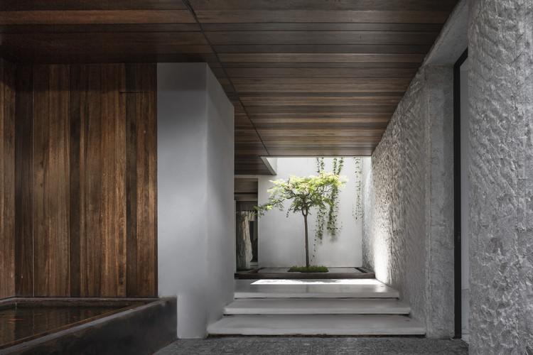
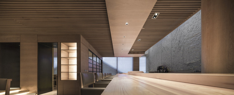
In addition, a dining hall in the Japanese style is also included. The designer chooses brown and white as the main colors of the space.
